
Good Morning everyone! Happy Thursday! This is the day that I am going to TRY and bring you a fun new tutorial each week for you to try over the weekend! This jewel took me a few days to write because it has been CRAZY at the house this week, but I promise you, it takes only a few minutes to try at home and it is so much fun!
Last week, I created a fun back to school folder template for one of my layouts I was working on, and as everyone knows, you can't have a folder without a crease in it! It HAS to fold right?? So I went about my merry way trying to create a fold and a crease line so that my folder LOOKED like a real folder! I had so much fun working it out, that I thought I would share a little tutorial with you today so that YOU can add folds and creases to your papers, photos or even your folders!
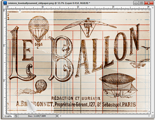
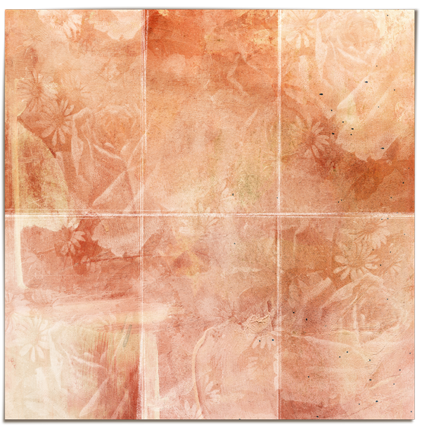
I am going to be using this fun element from Captivated Visions newest kit called "Love is all You Need" It is so pretty and vintagy and well, just gorgeous, but I want to add a little more texture to this element by giving it some creases and folds in order to give it a whole NEW look!
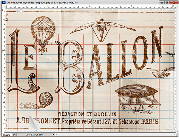
Here is the BEFORE element: (It's ALREADY fabulous, right?)

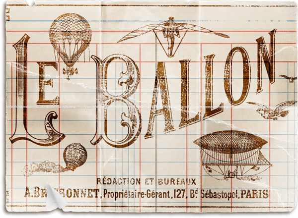
And here is the after element:

Isn't that great?? It looks like it should be so difficult, but this fun AND easy tutorial will help you add some time to your photos or elements...or even your papers, so that you can create a whole new look on your page! I am all about making your stash grow, and this is one way to do that! So lets get this thing started!
Open your paper, element or photo and add a new blank layer right above the document. To add a blank layer, click on the New Layer icon located at the bottom of the Layers panel.
Once you click on the New Layer icon, a blank layer (Layer 1) will appear right above your original paper or photo.

The easiest way to make sure that you are getting your measurements right is to use the Rulers. I happen to use mine ALL the time, but if you don't have your Rulers turned on, you will need to go to View>Rulers OR use the keyboard shortcut CTRL+R.

Once you turn on the rulers, they will appear at the top and left side of your workstation.

To add a vertical line to your document using the ruler, select your move tool, click anywhere inside the ruler on the left, and drag, with your
mouse button still held down, towards the right side of the page. Drag the guide line to about 2/3 the way across the document to add your first crease mark. It doesn't have to be perfect...after all, I know when I am folding a real life paper, I am not always real careful about my fold lines, so the fact that they AREN'T perfect..gives it more of a real look! Once you get your line where you want it, release your mouse button to
place the guide. If you need to move it for any reason, you can select the move key, hover over the line until you see the double arrow and then click your mouse again to drag the line to it's new location.

Drag and drop another vertical line about 1/3 of the way across the document. Then, using the same procedure, drag and drop a horizontal line about 1/2 way down the page by clicking on the top ruler and dragging the ruler down.

Next, we need to make the paper look like it is truly folded by adding a gradient to the paper. Select the Rectangular Marquee Tool from the Tools panel, OR (and this is my preferred method) use the keyboard shortcut M to grab it real quick like!

With your Rectangle Marquee tool selected, drag out the first section on the image by clicking on the top left corner and dragging a rectangle shape to the right bottom corner of the selection.

Select the Gradient Tool from the Tools panel, OR use the keyboard shortcut G to select the Gradient tool quickly.

Once you have selected the Gradient tool, right click inside the selection in order to view the Gradient Picker Options Window. Double click on the Black,White Gradient to select it and close out of the window.

Click and drag out the gradient following the illustration below. Wherever you begin to draw your gradient will be the black portion and it will fade to white at the point that you end your gradient, so if you want a particular part of your document to be shaded, that is where you are going to start your gradient.

Draw out the rest of the gradients using the same method. Select the Rectangle Marquee Tool (M), then drag out the next section on the document. This time, when you add the gradient (G), instead of going from bottom to top, try dragging the gradient in a new direction. By changing the direction of your gradients, it will make the paper look creased and folded! Finish drawing and adding the gradients to your document.

Once you have completed adding the gradients to your page, you can press CTRL+D to deselect the final selection you were working on. Also, to keep you from getting all confused, we can go ahead and turn the guide lines OFF. Go to View>Clear Guides to turn them off.
OK..are you ready for the magic now??? With the Gradient layer selected in your layers palette, change the blending mode of the layer to Soft Light.
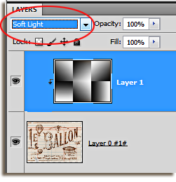
Voila! Your document should now have some shadows and some highlights! You can see that the dark areas on the document correspond to the dark areas of your gradient and same with the light/white areas. These areas are the beginnings of your folds! Now we just need to make them stand out a little more!
I wrote a tutorial several months ago on some of the fabulous, and often unused, features in Photoshop. Most of these wonderful features are found in the Filter menu and you probably, unless you design, have not used very many of them! One of the filters I like to play with, and the one we will use today is the Plastic Wrap filter. It is fabulous to use in in photos with water but, it can ALSO be used to help these folds start to come alive!
With your Gradient layer still selected, go to Filter>Artistic>Plastic Wrap.

The Filter Gallery Options menu will open and it is here that you can make some adjustments to the actual filter itself.

You can see on the illustration above, the Plastic Wrap filter is being applied to the gradient that we just created. That's pretty cool isn't it?? In the large window on the left, you will be able to see all the changes that you will be making to the document and you make those changes to the document by using the sliders on the right hand side of the filter gallery. Lets take a closer look at the sliders and the settings I used on my document!
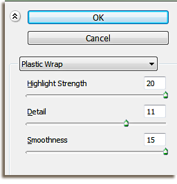
Begin by locating the sliders. you can see that these are the options for the Plastic Wrap Gallery. Change the Highlight Strength to 20. I have tried it a number of settings, and this is the one that works the best. Change the Smoothness slider to 15. Both of these numbers are pretty set in stone. They produce the best results. The Detail is a bit different though, and the setting for it will depend greatly on the look you are trying to create and the document you are creating it with. I will generally set this number to anywhere between 5-10, however, on this document, I went up one more to get the look I wanted. I just judge this one by eye! If you move the detail up higher in value, it will make the plastic effect stay closer to the fold lines, so if you want a strong crease, slide your slider more to the right (8-10). If you want a soft crease, you can keep the values more towards the left (around 5 or 6). Click OK to accept the changes.
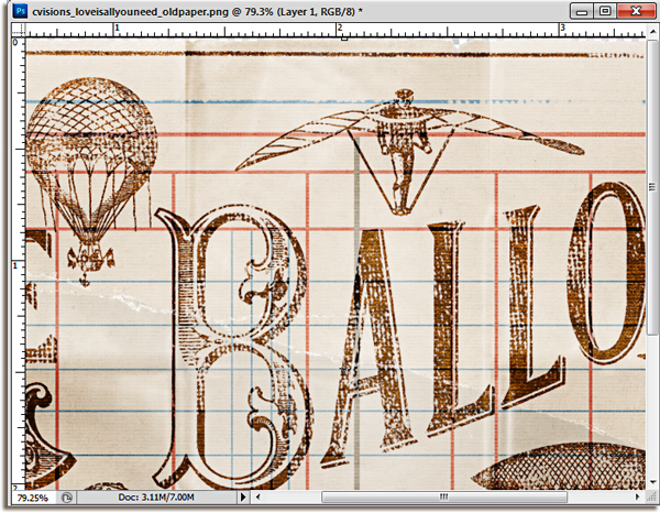
The folds, in the picture above, are a little more prominent. I can see a definite definition in the folds up top and can even see some of the wrinkles caused by the plastic on the top middle section.
The folds, in the picture above, are a little more prominent. I can see a definite definition in the folds up top and can even see some of the wrinkles caused by the plastic on the top middle section.
Let's make the final touches this document to make it look like it has been folded!
Create a new layer in the layers palette ABOVE the gradient layer. This will be the layer that we add the brushwork to. Select the Gradient Layer in the layers palette and click on the New Layer icon at the bottom of the layers palette. The new layer will appear right above the gradient layer in the layers palette.

Part of a real fold on a real piece of paper, is the actual bending of the paper that leaves it a little rough and torn around the fold. In order to make our folds appear more lifelike on a digital layout, we need to rough up the folds a little and make them look worn! We do this by using a custom brush!
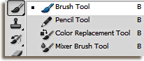
Select the Brush tool from the tools palette OR press the keyboard shortcut B for instant access!
Now let's go in and customize the brush so that it will do what we need it too! You should already have your Brush tool selected. With your mouse, hover over the document, right click anywhere inside the document, and right click. This will bring up the Brush Picker options window. The best type of brush to use is something that has a scatter to it because we want it to look like the paper has fibers! Depending on how your brush tool is set up you may need to go in and choose a different set of brushes to work with. I have mine set to the Basic brushes that I use on a normal basis, so in order to load a different group of brushes (and one that holds the type of brush I need) go to the top right hand side of the Brush Picker box and click on the arrow to expand the brush selection.
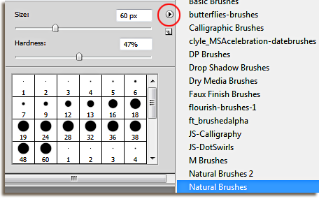
I am going to use a brush from the Natural Brushes selection, so click on the option to select and load the brushes. Once you have said ok, the brushes will load, and you can then pick the specific brush that you want to use by double clicking on it.
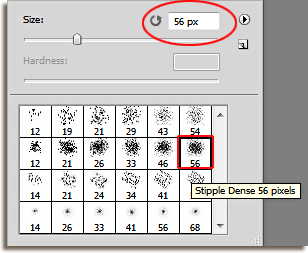
You can adjust the size of the brush at the top of the options window by moving the slider left or right OR, you can use the bracket keys ( [ and ] ) on your keyboard to adjust the brush while you are working on the document. [ decreases your brush size while ] increases your brush size. For now, I am going to stay with the default size of 56.
Now let's go in and customize the brush so that it will do what we need it too! You should already have your Brush tool selected. With your mouse, hover over the document, right click anywhere inside the document, and right click. This will bring up the Brush Picker options window. The best type of brush to use is something that has a scatter to it because we want it to look like the paper has fibers! Depending on how your brush tool is set up you may need to go in and choose a different set of brushes to work with. I have mine set to the Basic brushes that I use on a normal basis, so in order to load a different group of brushes (and one that holds the type of brush I need) go to the top right hand side of the Brush Picker box and click on the arrow to expand the brush selection.
I am going to use a brush from the Natural Brushes selection, so click on the option to select and load the brushes. Once you have said ok, the brushes will load, and you can then pick the specific brush that you want to use by double clicking on it.
You can adjust the size of the brush at the top of the options window by moving the slider left or right OR, you can use the bracket keys ( [ and ] ) on your keyboard to adjust the brush while you are working on the document. [ decreases your brush size while ] increases your brush size. For now, I am going to stay with the default size of 56.
Once you have selected a scatter brush, it is time to make some changes to the way the brush will actually work! Press F5 on your keyboard to open the Brush Panel in Photoshop. The Brush Tip Shape option should be highlighted. If not, click on it to activate the window. Change the Roundness setting to around 10-12%. Then, change the spacing to 50%.
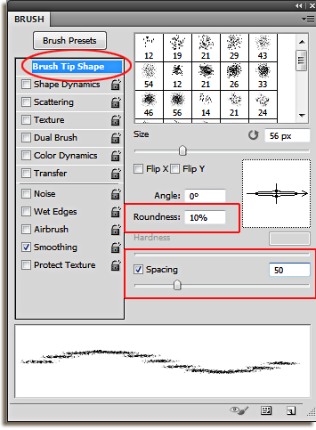
Before you make any other changes to the brush, locate the options under the Brush Preset Menu and UNCLICK anything that is already checked. For instance, the Smoothing option is selected in my photo above, so I will need to click ON the arrow to turn it off. Once you have a clean slate, so to speak, we can adjust the remainder of the brush attributes!
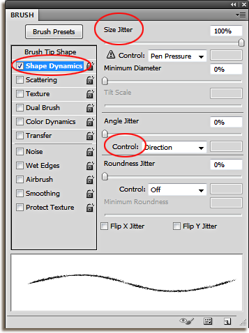
Click on the WORDS ...Shape Dynamics in order to select the option and open the menu. If you just check the line, the options panel will not open and you can't change the brush dynamics in any way. Once you click ON the words "Shape Dynamics" a new menu will open and you can change the "Size Jitter" to it's maximum output...100%! Also, change the Angle Jitter Control to Direction!
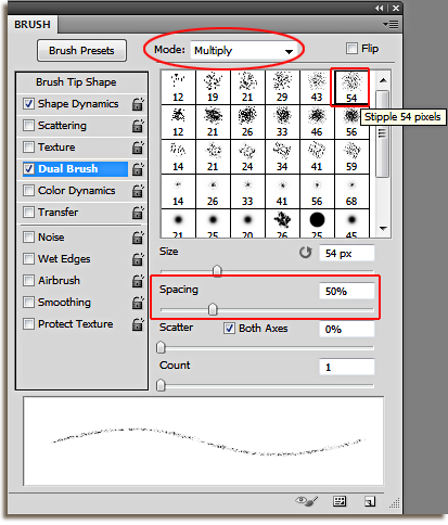
Finally, we need to add a second brush to the first one to give the new crease some added dimension. Choose the Dual Brush option by again, clicking on the words. Select a similar sized brush to the one you had before however, instead of choosing the dense version, choose the just the stipple brush. This time, I chose the Stipple 54 brush. Change the Mode to Multiply and increase the Spacing to around 50%. Press F5 on your keyboard to close the Brush Panel.
Now we are ready to "paint" on our creases. This part is really fun and easy! Make sure that the Foreground color is set to the color white. Hit "D" on the keyboard to set the Default colors, this will ensure that black is your foreground color and white is your background color. However, we need to paint the creases with WHITE, so hit the keyboard shortcut X on your keyboard to swap the colors, so that white is now your foreground color and black is now your background color.
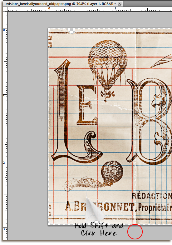
Click and release (in the gray area) on a spot above the document but in line with the newly created crease.
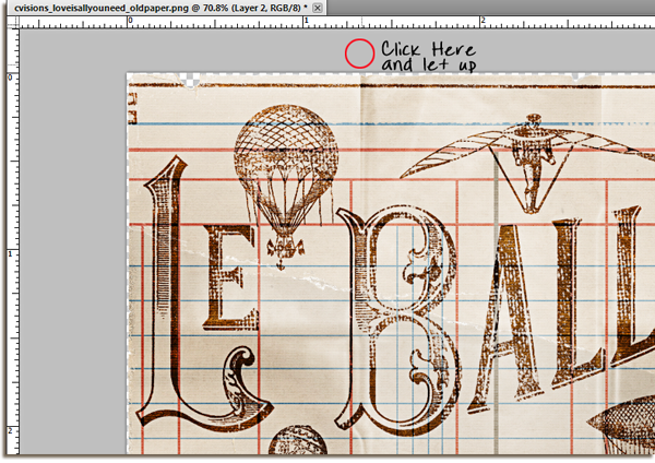
Hold the SHIFT key, and click in the gray workstation at the bottom of the crease. By holding the shift key when you click the position of the brush, Photoshop will draw a straight line from point A to point B.
Now we are ready to "paint" on our creases. This part is really fun and easy! Make sure that the Foreground color is set to the color white. Hit "D" on the keyboard to set the Default colors, this will ensure that black is your foreground color and white is your background color. However, we need to paint the creases with WHITE, so hit the keyboard shortcut X on your keyboard to swap the colors, so that white is now your foreground color and black is now your background color.
In order to get the best results when creating your creases, make sure that you can see the document on the actual workstation and not in a floating window! You will actually need the workstation to help you paint the creases, so this step is pretty important! Hit Keyboard shortcut F to enter the full screen mode.
Click and release (in the gray area) on a spot above the document but in line with the newly created crease.
Hold the SHIFT key, and click in the gray workstation at the bottom of the crease. By holding the shift key when you click the position of the brush, Photoshop will draw a straight line from point A to point B.
Can you see the first brush stroke on the photo above?? THAT is your first crease! Now, repeat the process, making sure to increase (use ] ) and decrease (use [ ) the brush for a more natural looking crease. Each time you add a stroke of the brush, you will follow the same procedure as above. I usually will add about three or four passes on the same crease, using a variety of sizes. When you are done it should look something like this:
Continue the same process with the other vertical and horizontal creases. When you are finished, lower the opacity of the paintbrush layer to about 75-85%. How much I lower it depends solely on how light or dark the document is. In this case, I kept the opacity at 80%.

Once you lower the opacity, you are finished!! I took the opportunity to just brush over, with the same brush, the areas that were already "worn" by the designer, just to make them stand out a bit. You can create your own worn places as well by using the brush and making a few diagonal strokes. Here is the finished product!
I used this technique on a few other papers and elements as well so that you can see that this technique works on just about ANYTHING and will give your image a whole new look!
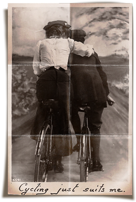
This is a photo card from the same kit. Love is All You Need by Captivated Visions and Ju Kneipp. With a few cool shadow tricks, and some corner manipulation...you can create a tattered photo for your heritage layouts! I love this one!
You can even use this technique on a full sized background paper!
The key is to change up the size of your brush...add some thicker creases and some thinner ones to make it more realistic, and, if you want to add a little more drama, use the burn tool at about 15% tool over the dark areas to create a little more depth in the folds!
That is all for this weeks tutorial, I hope you find it fun and interesting and useful! Have a great week...now go and try this tutorial out...you KNOW you want to!

What an AWESOME tutorial!! Thank you so much!
ReplyDelete